Weird Boxart?

  • Thread starter Thread starter jamesyfx
  • Start date Start date
  • Replies 11
  • Views 1,315

jamesyfx

Administrator
Administrator
Joined
Sep 24, 2020
Messages
1,122
Reaction score
400
Name
James
Having seen @Oblivion Knight post about Dino Crisis having a lazy poster reminded me of some weird or lazy boxart, typically regional differences.

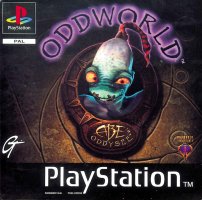
Like, did you know that Abe's Oddysee had a strange name change and boxart in Japan?
R.jpg
I mean, this is what we're all familiar with, right? Abe's Oddysee.
abeagogo.png
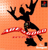
Enter.. Abe a Gogo. Same game, just.. for Japanese audiences.
abe99.png
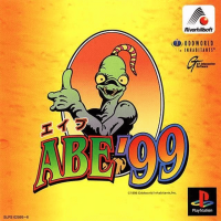
And this is Abes Exoddus, or Abe'99 as it was known in Japan

Also, some weird changes Nintendo made for the Western market... For example...

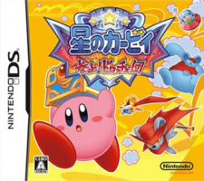
Do you know the game Kirby Squeak Squad? [What do you mean no?!]
79824806-30b1-4270-a0ab-631e56865639.png
So this is the Japanese cover. It's Kirby alright

kirby_squeak_squad__08325.jpg
Here's the US cover ... They made him ANGRY!​

Anyone got any up their sleeve? (see what I did there?) I can post some more too.
 
I found this one over on IGN (How Game Art Changes Around the World)..

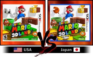
Super Mario 3D Land

IGN noted the blue plastic, but there's another change that is more glaringly obvious..

super-mario-3d-land.jpg
In making the journey from Japan to America, they changed the super leaf to a music block.. Why? 🤨
 
This ones always a good one...
R.jpg


It's Okami for the Wii. Doesn't look too bad does it?

.... or does it?

Take a closer look aaaand..

r2.jpg

... They just downloaded an image from IGN.com, watermark and all and used it for their box art. Lazyyyy...!

I heard they sent out 3 special edition covers for people that bought the dodgy box art version as an apology.
 
This ones always a good one...
View attachment 1228

It's Okami for the Wii. Doesn't look too bad does it?

.... or does it?

Take a closer look aaaand..

View attachment 1229

... They just downloaded an image from IGN.com, watermark and all and used it for their box art. Lazyyyy...!

I heard they sent out 3 special edition covers for people that bought the dodgy box art version as an apology.
Ha, I read about that one.. so lazy!
 
This ones always a good one...
View attachment 1228

It's Okami for the Wii. Doesn't look too bad does it?

.... or does it?

Take a closer look aaaand..

View attachment 1229

... They just downloaded an image from IGN.com, watermark and all and used it for their box art. Lazyyyy...!

I heard they sent out 3 special edition covers for people that bought the dodgy box art version as an apology.
Never heard about this, gotta say that's pretty hilarious. Next time I dig out my old games i'll have to check if my copy has the logo too, cos the version I owned was the Wii one
 
Here's another one, a bit more 'on topic'.

So the very first release of Resident Evil Revelations for the 3DS (US region only) had an embarrassing error. Can anyone spot it? I heard they produced around 100,000 copies of this and NOBODY in Capcom noticed.

revel.jpg


I'll let it speak for itslef​
 
  • Haha
Reactions: Lee
Whoops, that last one should never of made production. How embarrassing!
 
I'll keep them coming...

This isn't boxart per-se, but hey.. it's still weird that it got out there.

racenig.jpg


Future pressings of this game just had the games logo pasted on instead of it all typed out. Wonder why. :zombie_joy:
 
I think this stuff needs its own thread really, but here's what Capcom USA decided to do to Mega Man. It's infamous - so infamous in fact, that Capcom later added the character as a separate version of Mega Man.

I mean, here's the sprite for Mega Man on the NES:

Mega_man_sprite.png


Obviously, a cartoony anime-style character and even in the game is described as being modelled after a child.
But no, Capcom USA decided to make him... a hardened, middle-aged guy.

[H2]
Mega Man:​
[/H2]
Megaman1.png

[H2]
Mega Man 2:​
[/H2]
132415221868.jpg

There are more examples of this weirdness, but like I said that would need its own thread. It's so odd!


I also mentioned that Capcom introduced the character as a separate being, "Bad Box Art Mega Man" in Street Fighter X Tekken:

OIP.jpg

In all of his ... glory.​
 
The only example of regional differences I'd really know is Spyro 2's one, the Japanese version had a mad looking cover:

spyro2.png


I'd be lying if I said I didn't find it somewhat charming
 
The thing I love about Spyro is that in Japanese Katakana it looks like it says Ripto in English.. ( スパイロ ) the developers liked the name and used it for the antagonist for Spyro 2.
 
919425_57560_front.jpg


Here's Pure Pinball. As you'd assume by the cover, it's filled with scantily-clad female warriors of different eras.

… Nope. It's just a pinball game. The game has several, basic themed pinball tables and the cover has absolutely nothing to do with them. :facepalm:


ps3_batman_arkham_city_game_of_yea-110214.jpg


And here is Batman Arkham City, Game of the Year Edition

Or.. the 'Cheap Magazine Cover Edition' Edition. Why do they need to plaster all that shit onto the FRONT?


R.jpg


Here's the cover to the PC version of Forsaken

The crying lady on the cover, as well as the weird background have nothing to do with the game. Nor does the weird tattoo logo on her cheek.

The game is actually an early 3D first person shooter where you fly around on a hoverbike on a futuristic Earth, flying through tunnels shooting lasers and missiles etc.

Theres also another promo image they created for the game.. not sure why that exists... Oh yeah. I guess to sell to horny teenagers expecting something else:

1477523095-3022054497.png
 

Create an account or login to comment

You must be a member in order to leave a comment

Create account

Contact us for an invitation code, or proceed to Register if you already have one!

Log in

Already have an account? Log in here.

Home Register
Back
Top